 Untitled Flag #3
 shellac on curly maple, yellow birch, and bird's-eye maple
34" x 53" x 1"
34" x 53" x 1"


 Untitled Flag #3
 CraftBoston Booth Shot
 The Philosopher
 Billy Day Tart
 Scarifier
 Moon Boy Dreaming
 unknown title
 Gripped Beyond
 In addition to the cast urethane cabinet that I wrote about for that show, I really like what he did with this wavy ash cabinet. Unfigured ash can be a boring choice for fine furniture but by adding the waves he has essentially created figured lumber and by adding the color he has found a great way to highlight the grain.
 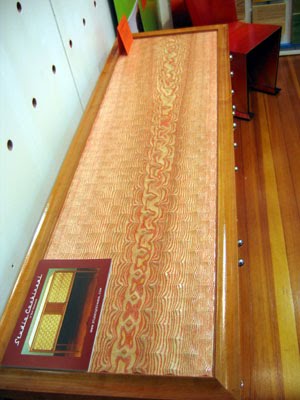 Here is a close-up. It is a technique that is both spectacular and distinctive.
 I also met Bonnie Birshoff of the J.M. Syron and Bishoff duo and was very impressed by their tamo and polymer clay veneered cabinet.
 This was my first encounter with tamo. It is a Japanese ash that can have spectacular figure similar to the highest quality quilted maple. Of course, I immediately wondered how I could get a hold of some of this as solid lumber, rather than veneer, but a quick Internet search indicates that money would have to be no object. Veneer like this could cost more than $7/sq foot so a board, 1 inch thick, if you could find it in the US (and I really doubt it) would likely cost more than $50/board ft. To get it I'm sure you would have to go to a Japanese mill and outbid the veneer buyers. I might as well stick with my local hardwoods, still, this is amazing stuff.
 tamo close-up
 After bleaching it a couple of times I still wasn't happy with the results so I did another search on how to bleach wood with lye and hydrogen peroxide and was able to find this excellent article by Jeff Jewitt. The mistake I was making was waiting too long to add the hydrogen peroxide after applying the lye. It needs to be done at the same time or very soon after.
 It is still a long way from being finished but I needed to put it together in order to see how it is going. I'm trying to get each of the blue pieces to be a different color.
 I think this is going to be the preferred orientation.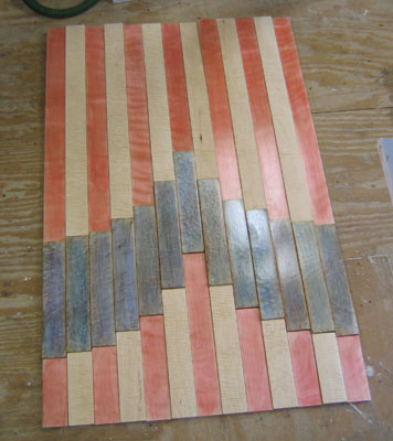
 On the doors and top he used the flat side of the cast on the outside, on the side panels the carved side is facing out. Ash was an excellent choice for making the mold because the grain pores are so open that it leaves a very visible grain pattern in the cast, thus the confusion on whether the doors are made of wood.
  Beyond the originality of using wood as a panel mold, the patterns he carved play with the grain pattern but are not tied to it. The piece is an interesting contrast between the natural and synthetic that I felt worked really well.
  Another pleasant surprise of the show is this Back of the Big House Table by Dale Broholm. I was absolutely fascinated by the simple beauty of the vertical grain fir he used for the table top.
  It is hard to capture with a camera, but trust me, it is amazing.
  Here is a close-up. I initially thought the top was quarter sawn ash but I checked with Dale and he corrected me. Still, this top inspires me to look for or mill myself some quarter sawn ash as well as vertical grain fir.
 The real thing was much more unusual and powerful than I realized. In the way that a whisper demands quite to be heard, the small scale of this piece demands your attention.
 17" x 15" x 15" (keys added for scale)
 The curl on this table top is amazingly tight. It looks more like a wood grain print over textile than wood.
 And the most fascinating thing about it is the underside. How often do you see a table that is at least as interesting to look at from underneath as from above?
 This piece, Citron Altar, was on loan from the collection of Mark and Juliana Phillips because Jon's entire studio, much of his personal collection of his work (including the piece he had made for this show), all his equipment, and a 40 year collection of special lumber, were tragically lost in a fire a couple of months ago. For more information, and any donations you would like to make to help him rebuild, check his site here.
 Made with Swiss pear but also including 18 year old Glenlivet Scotch, two sipping glasses, and two Cuban cigars, the $2400 price seems more than reasonable.
 And finally, I found myself oddly drawn to these chairs by Lothar Windels. They are very austere and simple yet still well crafted. Very utilitarian but still unique. They simultaneously look like they were caringly constructed but could also be made a million more times. The contrasts make them hard to overlook.
  With so many great artists in a show like this it is hard to do it justice and cover a fair percentage of it but these are the pieces that stood out the most for me. It is great to see studio furniture makers getting the attention they deserve and see the community supporting each other in making such a significant contribution to North Bennet Street School.
 Fear Not, Fall Not
 side view
 No Apology Necessary
 Time Float
 Starry Night Flag
 Untitled First Shellac Painting
 Three Blue Stripes (2010)
 Six Red Squares
 Cherry Ribbon (2010)
 Cherry Vase
 Posts
All Comments
Posts
All Comments


