Showing posts with label Cross MacKenzie Gallery. Show all posts

Tuesday, December 18, 2018

More Zigzags and Pentagons

Here are the indoor wall paintings I completed between February to December 2018. This first piece, Binding Light III, is part of a conceptual series of paintings that I have been making related to my curiosity about the nature of reality evolving out of my Buddhist practices. The random angled geometric shapes that have been a long time part of my art have always represented individuals to me. What I am particularly interested in is how individuals are "inseparably interconnected" to one another. The illusion of reality verses what is really going on. Consequently, although the painting is abstract on one level, my intent is not abstract at all.
Binding Light III
24" x 40.5"
mixed media on board
2018
My zigzag work is less conceptual and more about playing with color, experimenting with their interaction, and trying to generate some kind of visual energy. As with much of my work, I am more interested in selecting color combinations that create visual questions more than to have something that is aesthetically pleasing. The title of this one, Orange and Philinga, is a reference to a tombstone I came across while wondering around an old graveyard in Morrisville, Vermont for Orange and Philinga Cleaveland. Orange died in 1889 at 88 and Philinga died in 1870 at 66. I know nothing about them other than what is on the tombstone but with such names I assume they must have been wonderful people.
Orange and Philinga
31" x 25"
mixed media on board
2018
Here is the tombstone the painting is named after.

The underpainting for Orange and Philinga and Breathless was made specifically to be painted on top of, whereas the underpainting for Redemption was made on top of an old piece.

Breathless
36" x 18.5"
mixed media on board
2018
Of all the zigzag paintings in this batch, Redemption (below) is the only one in which I painted over an older piece. With the others I created the underpainting with the intent of painting zigzags on top. I first started working on this piece in 2010, and brought it out again in 2017 before finishing it this year.
Redemption
18.5" x 24"
mixed media on board
2010-2018
Intuitive Induction
28.5" x 31.5" x 1.5"
mixed media on board
2018
Kale Summer
20" x 18"
mixed media on board
2018
Would That (below) is available through Cross MacKenzie Gallery in Washington, DC.
Would That
46" x 35"
mixed media on board
2018

That Which
29" x 48"
mixed media on board
2018
When I made Innocent Insolence I was interested in the wedge shapes created by the zigs and the zags so I decided to paint each of them individually. When I was done I realized I still needed something to hold it together, and to give the shapes context, so I painted the zigzags on top after removing the tape. This painting, as well as Orange and Philinga, is available through Helen Day Arts Center until December 29, 2018.
Innocent Insolence
46" x 41.5"
mixed media on board
2018
Here is a closeup of the piece. 
Innocent Insolence (close-up)
Future Perfect started as a practice board, a place to experiment with ideas before working on an actual piece. But has the ideas were layered on top of one another I eventually felt that it was interesting in its own right, so I decided to finish it. I found the result interesting and it served as inspiration for the piece that followed, Present Perfect.
Future Perfect
23.5" x 31"
mixed media on board
2016-2018
Present Perfect is a combination of the piece above, Future Perfect, and the first piece on this post, Binding Light III. Although, with this iteration, I'm thinking maybe that binding light touches all around the beings rather than just at the points between them. I don't know.
Present Perfect
23.5" x 30"
spray paint, acrylic paint, and shellac on board
2018
With this last piece of 2018, Jatonisti, I felt that it needed another layer of something when I was done and, more out of frustration than anything else, I decided to doodle on top of it.

Jatonisti
23.5" x 25"
spray paint, acrylic paint, and shellac on board
2018

Sunday, December 20, 2015

Wednesday, November 25, 2015

Cross MacKenzie Show Installation Pics

I installed my show of new striped paintings/sculptures at the Cross MacKenzie Gallery in Georgetown (Washington, DC) on November 11. The show has been extended one week, now being on view until December 15. Originally, the plan was to install eight pieces so I brought twelve to give the gallery a selection of work to choose from but, fortuitously, we were able to hang all of them. Though it is difficult to see, we installed four pieces in the front window, including three of the one-sided paintings.

Though we hadn't originally planned on showing my canoe, the gallery director found images on my Facebook page and asked me to bring it. This canoe is absolutely not for sale but I agreed to let the gallery negotiate a commission one. I love the idea of it being considered a work of art because I built it with that idea in mind. I also agree with the gallery that it gives the viewer a clearer understanding of my art.
Even though we hung more pieces than we planned, I am happy with how much space they have, I don't feel they crowd one-another at all.


I hope you get/got the chance to see the show, the work really is much better in person. Additionally, the gallery has agreed to offer my bumper stickers with the same conditions that I do. I left some of my last three designs (#28, #29, and #30), so if you do stop in, you would have the chance to acquire at least one of my pieces for free.

Saturday, November 7, 2015

Show Card

Here is the card for my show at Cross MacKenzie Gallery, November 13 to December 9, with a reception on Friday, November 13, 6 to 8pm.


Tuesday, September 29, 2015

Solo Show @ Cross MacKenzie Gallery, Washington, DC

I'm excited to announce that I have a solo show scheduled at the Cross MacKenzie Gallery in Washington, DC (opening November 12, 2015). In preparation I took my most recent work to RLPhoto in Burlington, VT to get them professionally imaged. I wrote about the first six of these previously, here and here, but these images are so much better than the ones I captured I have to share them again. They are a really top notch professional photography studio and they are really great to work with -- I feel lucky that I am able to use them.
Sugaring Time
acrylic, oil pastel, epoxy, shellac on wood (with stainless steel hanging system)
80" x 23" x 1"
2015
If you looked at the earlier posts you may notice I made the titles more memorable so that I can talk about the work without having to refer to my notes to know which is which.
Sugaring Time (closeup)
I've also upgraded the hardware of this piece since it was first photographed. It now has a custom made stainless steal hanging system.
Sugaring Time (side two)
In making all of these pieces I've struggled with finding the right balance of bleed-out from the acrylic paint onto the wood. I want some because I like the play between the clean line caused by taping the paint and the soft fading of the color around it, but I don't want too much of it because I feel the piece ends up looking "muddy."
South Beach
acrylic, oil pastel, shellac on wood
34.5" x 10" x 1"
2015
I also like how the bleeding of color captures some of the natural and added texture on the piece, like these diagonal lines below. 
South Beach (closeup)
I don't often use cherry as a primary wood in my work because I love how the lighter woods work with color, but when I saw this piece in the lumber yard, with significant figure and plenty of light sapwood to add contrast, I had to make an exception.
All Species Day
acrylic, oil pastel, shellac on wood
41" x 16.75" x 1"
2015
All Species Day (closeup)
As with cherry, I've had a bias against using walnut but this board was so gorgeous, I again made an exception. In truth, I felt disappointed with it when I was done because I felt the colors didn't standout from the dark background enough but I've gotten so much positive feedback I can only assume that it was more successful than I had thought.
Bari Notes
acrylic, oil pastel, shellac on wood
58" x 10" x 1"
2015

Bari Notes (closeup)
I've also found it interesting how my feelings for April Dawn have evolved. As I was making it, I was enamored and thought it would be a great piece; but when I finished I first hung it horizontally and I was surprise by how unhappy I was -- it just seem to lack energy. After a couple of weeks I changed the orientation to vertical and was much happier but still a little disappointed, mostly because I felt I hadn't left enough wood visible and I thought the bleed was a little too muddy. However, much to my surprise, as I've shown it to friends I've consistently heard them say it is one of my strongest pieces. I've long thought that artists are often the worst judge of their work but I find it so interesting when I see it in myself as well. 
April Dawn
acrylic, oil pastel, epoxy, shellac on wood
72" x 16.25" x 2"
2015
It is hard to tell from these images but this piece is two inches thick in the middle and tapers down to about a half inch on the sides.
Sugaring Time (closeup)
After hanging April Dawn in my own living space and seeing how it interacted with other vertical stripped pieces in the same room, I was inspired to make a single piece that played with the same effect, this is the first to evolve out of that idea. One of the things that I like about this design is that it allows for the possible construction of an installation across an entire wall.
Anonymity
acrylic, oil pastel, epoxy, shellac on wood
45" x 10" x 5.5"
2015
Anonymity (Side Two)
Anonymity (closeup)
These last six pieces were all finished in September.
Cleveland, Ohio, 1975
acrylic, oil pastel, epoxy, shellac on wood
58.25" x 1.25" x 5.5"
2015
They are all hung on a mortised french cleat that I made myself. It is a super strong hanging system that lets me keep work tight to the wall even with a small surface area.
Cleveland, Ohio, 1975 (side two)
I like the simplicity/austerity of this piece.
Cleveland, Ohio, 1975 (closeup)
I originally envisioned these two pieces (above and below) as a single piece, displayed off-set from each other, but as I was working on them I realized they should hang separately, that they are more powerful on their own than together. 
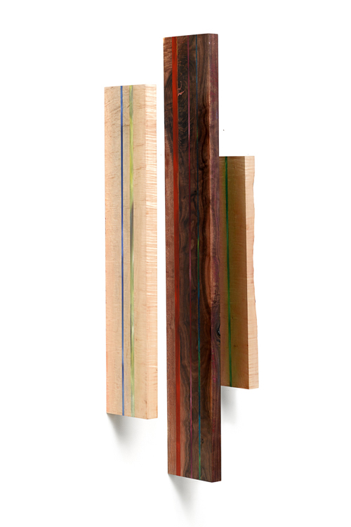
In Remembrance, For Ornette
acrylic, oil pastel, epoxy, shellac on wood
57.25" x 1" x 6.25"
2015
I like that one side is much lighter, having a lot of sapwood. As I've mentioned, I generally don't like using walnut as a primary wood because it is so dark but this board was so gorgeous, I had to make an exception.
In Remembrance, For Ornette (side two)
I like the saw mill marks left on this board, with the rough and smooth surfaces next to each other. I also love how the mill marks create gaps that can be filled with color. I feel that these "imperfections" have a commonality with O.C.'s sax playing style, hence the title, though I do feel a bit uneasy about making the comparison with such a great musician.
In Remembrance (closeup)
With these independently hung multi-piece pieces I'm not particular about hanging them exactly the same way each time. Rather, I have principles that I want to follow -- I want them to be off-set from one another; the order of the boards should be the same (in this case the dark board should be in the middle and the live-edge of the small board should be on the outside); and two of the boards should be close enough together that it isn't easy to see what is between them. 
Namibia
acrylic, oil pastel, epoxy, shellac on wood
46" x 14" x 6"
2015
Namibia (side two)
Namibia (closeup)
Breakfast In Tunis
acrylic, oil pastel, epoxy, shellac on wood
35" x 1.25" x 10.5"
2015
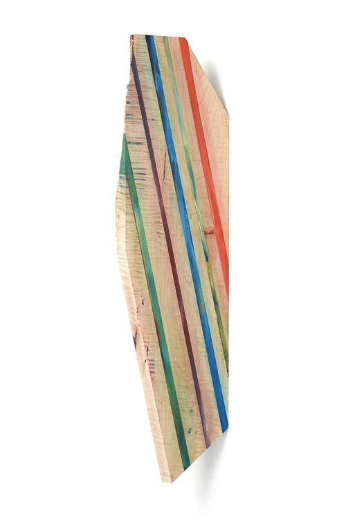
When I first came up with idea of using mortised french cleats to hang work on edge I was excited because I realized that it opened up the possibility to make work like these last three, work that can appear to be flying off of the wall or maybe even floating.
Breakfast In Tunis (side two)
Breakfast In Tunis (closeup)
I also love that this work demands to be seen by protruding into a room. They don't blend into the background and they force the viewer to walk around them. I also love how they exist in a place that isn't distinctly painting or sculpture, but equally both.
Voyager
acrylic, oil pastel, epoxy, shellac on wood
47" x 1.25" x 10.5"
2015
Voyager (closeup)
Voyager (side two)
I love apple season in Vermont. There are so many great and rare varieties arriving in the market and changing throughout the season. I know and love a few of them but mostly I'll randomly buy unknown varieties without worrying about learning their names, just being confident that I'll like what I taste and happy to be surprised.
Apple Season
acrylic, oil pastel, shellac on wood
50" x 1.25" x 10.5"
2015
I also love the saw mill marks left behind on this board.
Apple Season (closeup)
Apple Season (side two)
If you are in or near DC in November/December 2015, I hope you'll get a chance to see the show and look at the work in person! If you do, please share your thoughts with me.