Sunday, May 9, 2010

ArtPrize Proposal

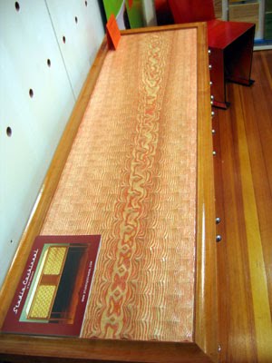
This is my ArtPrize proposal. I submitted it last week but might not know until July if a venue is willing to display it. If you click on it you can see a larger version to make reading the text easier. I call it the State of the Union flag because I plan to propose that it be used as the backdrop behind the President during the State of the Union address, in the hopes that commentators will talk about the art behind the President rather than their interpretations of what was said.
I went to the lumber mill/yard last week to select the wood. Although the proposal says bird's-eye maple for the blue/navy/purple stripes, they didn't have any that would work. Instead, they had some blistered maple, which I decided would actually be better because it would be more visible from a distance. I also selected two large boards of curly maple for the white stripes but, unfortunately, because of the way one of the boards was warped, the white stripes would have only been about 3 inches wide instead of the 4 that I'm planning. So I need to go back sometime and look again. For the red stripes I found some yellow curly maple that is more figured, and more fabric-like, than what I had previously selected. Although the other lumber was good, I couldn't honestly say that it was $250,000 good. One way I could tell that the new curly yellow birch was better than what I had previously selected was that in rough cutting and milling it, it was binding around the bandsaw and tearing out terribly while flattening it with the jointer. The earlier lumber didn't give me any of those problems.

Because of the success of ArtPrize last year, all indications are that it will be a much larger event this year. The competition just to get in is going to be huge, let alone into one of the prime venues and having a chance of winning. Regardless of whether the work is selected, I'm still committed to building it. One of the best things about the event is the inspiration to make something that has a chance to win, which alone could be enough to launch an art career.

Friday, April 23, 2010

Flag #3

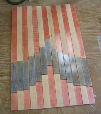
I just finished the third of the flag series. It is experimental in that I wanted to use it to work out some design issues for the large ArtPrize flag that I plan to make this summer. I want to start moving in the direction of multi-level work with sections that are individually painted then assembled at the end. The technique can also be used to make work multi-directional as well.
Untitled Flag #3
shellac on curly maple, yellow birch, and bird's-eye maple
34" x 53" x 1"


Thursday, April 15, 2010

CraftBoston Debrief

I just got back from the CraftBoston show over the weekend. I was very impressed with the quality of the show. The vast majority of artists also participated in the most competitive juried shows in the country, including the Smithsonian and Philadelphia Museum shows. Unfortunately, the majority of people I talked with (but certainly not all) were disappointed with sales. As a wall art artist I almost feel like the entertainment between jewelery and clothing booths (where the majority of sales occur). After two really poor show sales (Paradise City - Marlborough was only slightly better than the goose egg laid at this one) I have to wonder if these shows are the best venue for my work. The truth is that I really don't think it is, but I'm not sure what the alternative is either. The shows offer a massive amount of exposure that I can't get any other way and I can only hope that the exposure pays off at some point. With larger work on the higher end and nothing inexpensive for sale, one has to expect that people have to think about it and that sales will happen down the road. I don't really find the lack of sales depressing, rather, I find it confusing. I wonder if the Boston area isn't the right place for my work, are the people too conservative? (I seemed to get a better response at the Northampton shows that have much more of a NY audience). Is it the economy? (Some people are selling alright so I can't blame everything on the economy). Some artists talk about the changing demographics with an aging population that has enough stuff already. Whatever it is, I am sure wall art is a tougher sell right now, maybe for the indefinite future.

CraftBoston Booth Shot

Although it is extremely hard to be objective about your own work, I think I'm producing the best art I have ever made and I still get a good response from enough people to make me think that I'm not completely off-base (aside from one women who wanted to know if my work was flooring), so all I know to do is to keep on going (I was delighted to learn that a glass artist couple actually voted for my booth for the Artist Choice Award, given the quality of work at this show, just getting one vote is a huge accomplishment.) Maybe I'll get into the other top shows (I've already applied for the Philadelphia museum show for the fall) and get better exposure (and maybe, just maybe, sales). My hope is to eventually get out of the show circuit, either though gallery representation and/or a network of commissions and collectors but that kind of wish is the holy grail of the arts community, attained by only a select few though some mysterious alchemy that combines hard work, luck, talent, drive, marketing and more work. These shows are painfully expensive, exhausting, and stressful. It is a hard way to make a living even if you are making a living from it. My fear is that the show circuit is a never ending loop that you enter with a plan to leave but can't get out once it starts to work for you. Some jewelery artists I've talked with do more than twenty shows a year.

Besides the exposure, these shows are a great opportunity to meet other artists and see their great work. Of the wood artists, I was particularly drawn to the intriguing sculptures of Bruce Chapin. His work is mysterious, thought provoking, and very soulful; seemingly generated from the unimpeded subconscious. I suspect Carl Jung would have a field day with it but it is probably more interesting to just leave them for wonderment.


The Philosopher

Billy Day Tart

Scarifier
Several of his pieces had doors that open to some other object inside. This is the only one that I was able to get a decent image of. Some are more evocative of a human form on the outside or more evocative of a soulful form on the inside.

Moon Boy Dreaming

unknown title

Gripped Beyond

I also got to meet Bart Niswonger whose work I had seen at Gallery NAGA a few weeks earlier.

In addition to the cast urethane cabinet that I wrote about for that show, I really like what he did with this wavy ash cabinet. Unfigured ash can be a boring choice for fine furniture but by adding the waves he has essentially created figured lumber and by adding the color he has found a great way to highlight the grain.
Here is a close-up. It is a technique that is both spectacular and distinctive.
I also met Bonnie Birshoff of the J.M. Syron and Bishoff duo and was very impressed by their tamo and polymer clay veneered cabinet.
This was my first encounter with tamo. It is a Japanese ash that can have spectacular figure similar to the highest quality quilted maple. Of course, I immediately wondered how I could get a hold of some of this as solid lumber, rather than veneer, but a quick Internet search indicates that money would have to be no object. Veneer like this could cost more than $7/sq foot so a board, 1 inch thick, if you could find it in the US (and I really doubt it) would likely cost more than $50/board ft. To get it I'm sure you would have to go to a Japanese mill and outbid the veneer buyers. I might as well stick with my local hardwoods, still, this is amazing stuff.

tamo close-up
In talking with other artists at shows, I find it amazing that anybody ever figures out how to make a living doing this. A lot of very talented people with top quality work are struggling. Still, I think there must be a way to make it work. Unfortunately, beyond winning ArtPrize, I'm at a bit of a loss for ideas.

Wednesday, April 7, 2010

Flag Proposal #3

I've started the third of my flag series in order to work out some construction issues with what I am planning for my State of the Union flag. The curly yellow birch I've used for this one is the left over lumber after rough cutting what I needed.

With this piece, and future ones, I am trying to add more levels so that they are more sculptural. There is about a 1/4" difference between the stripes and another 1/8" inch added to the blue sections.

The bird's-eye maple was made up of a lot of heartwood so I had to bleach it in order to get a better blue on it.
After bleaching it a couple of times I still wasn't happy with the results so I did another search on how to bleach wood with lye and hydrogen peroxide and was able to find this excellent article by Jeff Jewitt. The mistake I was making was waiting too long to add the hydrogen peroxide after applying the lye. It needs to be done at the same time or very soon after.
It is still a long way from being finished but I needed to put it together in order to see how it is going. I'm trying to get each of the blue pieces to be a different color.
I think this is going to be the preferred orientation.

Wednesday, March 24, 2010

North Bennet Street Benefit Show Full of Surprises

I stopped by Gallery NAGA last week after setting up for the Paradise City - Marlborough show in order to see For North Bennet Street, a benefit exhibition of studio furniture makers in which 50% of the sale price goes to the North Bennet Street School, Boston's 125 year old traditional craft school with prestigious programs in furniture making, bookbinding, violin making, among others.

One would think that it would be hard to attract top quality talent for a show in which the artist only gets 25% of the sale price but this show is really a great mix of high quality work from both superstars in the studio furniture world and up-and-comers. Although Gallery NAGA selected the artists and pulled together the show, a good portion of the credit for the quality has to go to the schools executive director, Miguel Gómez-Ibáñez, whose personal relationships with with many of the artists surely influenced their decisions to participate. Here is a list of participating artists:

Garry Knox Bennett
Dale Broholm
Jon Brooks
John Eric Byers
Mark Del Guidice
John Dunnigan
Ben Fleis
Hank Gilpin
Miguel Gomez-Ibanez
Thomas Hucker
Silas Kopf
John Marcoux
Judy Kensley McKie
Bart Niswonger
Jere Osgood
Todd Partridge
Timothy Philbrick
Mitch Ryerson
James Schriber
Tommy Simpson
Rosanne Somerson
Jay Stranger
J.M. Syron and Bonnie Bishoff
Tim Wells
Steve Whittlesey
Lothar Windels
Rick Wrigley

Of all the pieces in the show, my favorite is Bart Niswonger's Green Cabinet made with ash, cast urethane, and paint. It shouldn't be surprising to see original work in a show of such talented artists, but this piece is really something different. Although I really liked it when I first saw it, it left me a little confused. I didn't realize that the ash he had carved for the panels was just used as a mold for the urethane.
When the gallery director, Meg White, showed me that the panels were pure urethane, I liked it even more. On the doors and top he used the flat side of the cast on the outside, on the side panels the carved side is facing out. Ash was an excellent choice for making the mold because the grain pores are so open that it leaves a very visible grain pattern in the cast, thus the confusion on whether the doors are made of wood.

Beyond the originality of using wood as a panel mold, the patterns he carved play with the grain pattern but are not tied to it. The piece is an interesting contrast between the natural and synthetic that I felt worked really well.

Another pleasant surprise of the show is this Back of the Big House Table by Dale Broholm. I was absolutely fascinated by the simple beauty of the vertical grain fir he used for the table top.

It is hard to capture with a camera, but trust me, it is amazing.
Here is a close-up. I initially thought the top was quarter sawn ash but I checked with Dale and he corrected me. Still, this top inspires me to look for or mill myself some quarter sawn ash as well as vertical grain fir.

Another surprise of the show was seeing this table by Rosanne Somerson. From the image that the gallery used for their publicity (below) I thought it was typical coffee table size, but on entering the gallery and seeing the real thing, I found that the title, Small Table With Leaves, was really meant to emphasize the word small.
The real thing was much more unusual and powerful than I realized. In the way that a whisper demands quite to be heard, the small scale of this piece demands your attention.

17" x 15" x 15" (keys added for scale)
white oak and limestone

I also loved this table by Jon Brooks.
The curl on this table top is amazingly tight. It looks more like a wood grain print over textile than wood.
And the most fascinating thing about it is the underside. How often do you see a table that is at least as interesting to look at from underneath as from above? This piece, Citron Altar, was on loan from the collection of Mark and Juliana Phillips because Jon's entire studio, much of his personal collection of his work (including the piece he had made for this show), all his equipment, and a 40 year collection of special lumber, were tragically lost in a fire a couple of months ago. For more information, and any donations you would like to make to help him rebuild, check his site here.

Another surprise is this Scotch and a Cigar - Drink Cabinet by Ben Fleis which just gives a hint of its contents through the partial screen cabinet door.

Made with Swiss pear but also including 18 year old Glenlivet Scotch, two sipping glasses, and two Cuban cigars, the $2400 price seems more than reasonable.

I was also drawn to this off-the-wall small table, Trien, by John Marcoux, made with bass wood rulers, wing-nuts, and paint. It is a pleasant and jarring contrast to the fine furniture in the rest of the show, a little wake-up call to relax and just enjoy.
And finally, I found myself oddly drawn to these chairs by Lothar Windels. They are very austere and simple yet still well crafted. Very utilitarian but still unique. They simultaneously look like they were caringly constructed but could also be made a million more times. The contrasts make them hard to overlook.
With so many great artists in a show like this it is hard to do it justice and cover a fair percentage of it but these are the pieces that stood out the most for me. It is great to see studio furniture makers getting the attention they deserve and see the community supporting each other in making such a significant contribution to North Bennet Street School.