Tuesday, July 24, 2012

Building A Canoe: Steps II, III, and IV

After making the sawhorses, the next step was making the strips. I decided to make my canoe out of basswood and walnut because for some reason, I can't say why, I wanted as much of a dramatic contrast as I could get. I had thought about staining white cedar black but with all the sanding and shaping that is needed once it is together, I realized I would have to restain it after the assembly which wouldn't likely look too good because of the difficulty in getting the stain lines to be precise.


I had never worked with basswood before but it is known to be easy to work and it is light in color and weight. It isn't rot resistant like cedar but with all the epoxy and varnish, I didn't think it was really an issue. I also was concerned about the possibility that basswood and walnut would shrink and swell at significantly different rates but I checked and, though they aren't the same, they are in the same ball park. Again, with all the epoxy and varnish, I didn't think the changes would be significant. 


I've worked with walnut a lot and know it is also easy to work and relatively light, although I was surprised at how much more dense it is than basswood since I'm usually comparing it to maple or ash. I had notice basswood was mentioned as a wood choice in the Gilpatrick book but I had never heard of anyone building a canoe with walnut but I figured that was probably because of the cost. Objectively, it does seem like a crazy wood to chose but I'm not looking for a sane canoe, just one I'd like to look at.


In reality, the cost of the lumber is a real small part of the whole project, even with the walnut. Basswood is ridiculously cheap. I bought 28 board feet for $25.20. The walnut is of course much more expensive. The lumber yard was selling it for around $7.50/bd-ft but I figured I had enough older stock which I had bought for around $6.00/bd-ft so I didn't get any more (hopefully the price comes down before I need more) I didn't do an actual count of how much walnut I'm using but I'm sure the cost is under $30 (in comparison, the fiberglass and epoxy will cost around $600). To my surprise though, when I started milling the walnut I had, I found I had some exceptionally figured pieces. I actually would have preferred that it was straight grained because it would be easier to work but, hopefully, the curl will show through all the fiberglass. 


Once I had the lumber I spend a two or three days dimensioning it and then cutting the strips and milling them with cove and flute edges so the fit together tightly around the canoe forms. One of my goals in dimensioning was to get a variety of widths between 3/4" and 1". Luckily, I was able to get three sizes, 3/4", 7/8", and 15/16". Since my shop is pretty tight, I couldn't work with lumber larger than 9' so for the basswood my strips are either 4', 6', or 9'. With the walnut my strips are much smaller with the longest being 5'.


Based on the information in the Gilpatrick book, I thought I needed between 1400 and 1600 linear feet of strips. When I had finished I was a little short, only 1385 but given that my widths are greater than what he was using I hoped I'd be okay (after finishing about 1/3 of the canoe I've done another count and I'm sure I have plenty).
1385 linear feet of bead and flute strips
Normally the next step would be to build the strongback and canoe forms but I was lucky in having a friend of a friend lend them to me. Given that I don't foresee building another canoe, building the strongback is a lot of work for something that I don't even know where I'd store it when I'm done. Having the forms already made was also real helpful because the Gilchrist book doesn't provide clear dimensions and pulling the measurements off the drawings is difficult. 

As a side note, I think it is worth mentioning the size of the sawhorses again because I couldn't find any recommendation as to how high they should be. I ended up adding a couple of inches to bring them to 27". I'm 6'1" and I think that is a good height for me, make adjustments accordingly. The good thing about the two inch spacer is that I can easily remove them if I find that they are too high when I'm working on the bottom.
After I installed the first strip I walked away from the project for five days in fear that I wouldn't be able to do what I was envisioning. Until you start, it is difficult to understand how much the wood has to bend and I wasn't sure how I was going to attach small sections of strips, especially of the stiffer walnut, and get it to glue tight. That second row is a killer because it is the point of no return where you start gluing. 
After five days I worked up the nerve, bring all the clamps and fastening devices I could think I might be able to use. After the fact, I realize I should have flipped the strips so that the flute side was facing up. With the cove side facing up (as I did it) I risked damaging the edges as I clamped them between the forms. I would have re-done the first row because of it but I was nervous that I didn't have enough strips and didn't want to waste any. 
I quickly realized that staples would not work for holding the strips because the walnut was too hard -- the staples would just bounce off. So I ended up pre-drilling holes and attaching them with drywall screws. Unfortunately, this meant that the forms would be shot by the time I was done. I should have just made copies of them before starting so I wouldn't damage the borrowed ones but then I figured I'll just copy them when I'm done so the lender can get a new set.
I have been going with a random width, random length design. I don't want the finished piece to be at all visually predictable. Along with the dramatic contrast, I think it will be visually very interesting. Another feature that I'm planning on is to use different size walnut and maple dowels to fill all the drywall screw and staple holes (contrasting with the color of wood the hole is made). In addition to adding another layer of interest to the piece, I think it will give it a rougher look, which is important given that so much of it is made with walnut -- I don't want it to look too precious, I want it to look like it doesn't matter if it runs into rock and gets a dent.
In this last image you can see that I added one strip of cherry in the middle lower section. I really wanted one piece to be different than everything else and cherry is a nice intermediate color. Incidentally, this canoe would have been easier (and cheaper) to make with cherry instead of walnut. To my surprise, cherry is much easier to staple than walnut.
As I'm going along, I'm more pleased with how it is coming out. It is slow going though. With all the choices to make -- width, length, type of wood, avoiding lining up the joints, how to clamp or attach section, along with all the time needed to step back and admire the progress, along with the extra time needed to daydream -- it is taking me about 45 minutes per row per side. To give myself a mental break, every now and then I add an all basswood row, they are so much easier to install.

Saturday, June 30, 2012

Building A Canoe: Step One

I have been contemplating building a canoe for many years. I'm not sure how many but at least ten, and during the previous year I've been seriously mulling over the design. Now, finally, I have officially started, and completed, step one, building a pair of midget -- sorry, vertically challenged -- saw horses. 
I think they look real funny, being just 25 inches high, but they need to be short because they are topped by a six inch high strong back and canoe forms which add another 18 inches.


Though they are aesthetically nothing special, I'm happy with them because I've finally found a use for some of the dozens of barn flooring boards I have had stacked in my backyard (I'm sure to my neighbors' dismay and annoyance) for the last seven years. I originally thought I could use them in some kind of domestic project, being that the boards are probably well over 100 years old (and probably old growth), but I quickly realized that they had been pickled in horse pee for many decades so bringing them indoors was not going to be an option.


I'll post images as the project comes together but my goal is that final product both floats and, most importantly, is a stunning work of art. Though I don't have any experience in building a canoe, or any other boats, I know people who have and I've been peppering them with questions for several months now. Based on their recommendations, I'll be using Gil Gilpatrick's Building A Strip Canoe as a guide and constructing his Wabanaki canoe design, a 16 foot general purpose solo or day tripping craft - perfect for exploring the many beautiful lakes throughout Vermont. Hopefully, it will be finished before the ice sets in this year.

Sunday, June 17, 2012

This Is What A Masterpiece Looks Like

Though readers of my blog will agree that I tend to be effusive about work I like, even so, I'm not cavalier with the "M" word. In fact, I have never previously used the word in this forum; however, on my most recent trip to the Renwick Gallery I looked at Kim Schmahmann's Bureau of Bureaucracy closely for the first time and realized how special it is.
Bureau of Bureaucracy 
various hardwoods, veneers, marquetry, mother of pearl, gold leaf, and brass,
with french polish shellac finish
96" x 36" x 24" 
1993-1999 
©Kim Schmahmann
I'm not sure why I skimmed over it so many times previously. Perhaps, because of its classical design and impeccable construction, it deceived me into thinking it was "just" another reproduction; or maybe I realized it was a masterpiece but was overwhelmed by the thought of analyzing it; or, maybe I was just overwhelmed by all the other great art in the space and was too distracted to spend the necessary time with any one piece (I sometimes wish curators would stop putting so much great art in museums); but on this visit Bureau had been moved to the center of a room, giving me a chance to see the back side for the first time and really forcing me to spend more time looking at it.
Bureau of Bureaucracy (rear view)
As I looked, I was fascinated by the symbolism that was obviously everywhere, but difficult to decipher. Luckily, immediately after spending time studying it, I walked into an adjoining room where the museum had a video running of artists talking about their work and, coincidentally, Kim was talking about this very piece, giving me a chance to finally learn about the conceptual aspect of the work.


Thoughtfully, Kim has developed a brochure that also discusses some of the features of Bureau, so it isn't necessary to just happen upon the video in order to understand what he has done (the link to it is here). As a result, I don't need to reiterate what he has already documented. If you look it over though, I guarantee you'll be impressed. You will also understand why it took six years to complete.

While looking at it, I was intrigued by the two small door panels (covered with paper collage) in the lower section next to the curly maple file draws. You can barely see them in the top photograph, and there was no way to read them in the museum (without getting thrown out or arrested), but I hoped that by taking digital images I could read them at home by blowing them up (I was about 75% successful).

Bureau of Bureaucracy
(top door panel on lower level)
It appears to be a series of documents associated with Kim's life in South Africa during the time of apartheid. It includes his Identity Document (in which he is classified as a white person in accordance with the Population Registration Act of 1950); some appropriately bureaucratic language about losing South African citizenship if you take the citizenship of another country; a couple of letters associated with his education, one of which, written "To Whom It May Concern" says that he is a part-time student taking Monday evening classes (dated in 1974), perhaps because there was a curfew and he would need to present the document to be out at night; and additional sections which are either too small or in Afrikaans.

Though it is mostly hidden and almost impossible to decipher, I think this panel is really the heart of, and the inspiration for, the entire piece. Only a series of traumatic and unfortunate encounters with a well organized but absurd and authoritarian government, such as one would have living in an apartheid South Africa, could cause someone to dedicate six years of their life to transforming the concept of bureaucracies into a work of art.  
 
 Bureau of Bureaucracy
(bottom door panel on lower level)
The panel on the lower door seems to be made from a collage of documents mostly associated with his time in the United States.  In the center are the rules for the ancient game, Snakes and Ladders, that Kim modified and incorporated into Bureau (image below); A letter of acceptance from the Association of Collegiate Schools of Architecture regarding a presentation at a conference; a letter from the US Department of Justice, Immigration and Naturalization Service; a letter of acceptance for Kim's submission to the Taunton Press for their Design Book Six; a certificate from the Boston Architectural Center; and one additional document I can't make out at all.
 Bureau of Bureaucracy
marquetry Snakes and Ladders game board
(image taken from Kim Schmahmann's website)
One last image I'd like to include is a closeup of the top section. In it, you can see the fine symbolic marquetry (that is explained in the pamphlet) that Kim used to create the door on the left (which covers a series of symbolic drawers). On the right is a model of the reading room at the Library of Congress.
 Bureau of Bureaucracy (closeup)
Bureau is unequivocally a great piece, but I think it really goes above and beyond most other great art because, in addition to being both impeccable in design and astounding in execution, it is, most importantly, a deeply personal piece in which Kim obviously poured his heart and soul with absolute dedication. Thanks Kim!

Tuesday, June 12, 2012

This Is Not A Tree

Last fall I saw Roxy Paine's new sculpture, Graft, in the National Gallery Sculpture Park on the Mall in Washington, DC and I have been debating the work in my head ever since. 
 Graft
stainless steel
2011
Roxy Paine
I know that it is both technically and visually a great piece but I don't like it -- in fact I hate it (looking at it actually makes me feel a little queasy and ill). But I haven't posted anything earlier because I've been questioning myself, wondering if I'm just being unreasonably uptight or reading more into it than I should, or if I'm the only one that sees something unintentionally sinister in it.
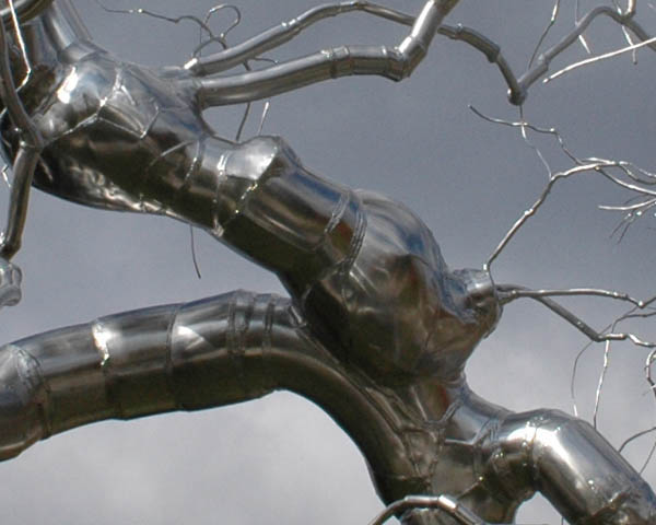
 Graft (closeup)
The problem is that, to me, it looks like a cyborg tree and makes me think of a world (today? in the future?) in which people think they can replace trees with technology, that somehow we can get along independent of the natural world. It is a sculpture of a tree but I don't think it glorifies trees, I think it is saying, "We can do better, what is around you -- the things you see every day -- really aren't good enough, we can make them modern and shiny and better." 
Graft (closeup of closeup)
So I've also debated whether it is great art because it evokes a strong emotion in me, and I've finally concluded that it isn't because in watching the reaction of people to the work I felt that they only saw the shine, not the implications (which I see) of a world in which trees are replaced with machines and we all have to breath manufactured oxygen. For me, to be a great work, it would have to make people think, and I don't believe that it does. But then, like I said, maybe I'm just being uptight. It would be great to hear other opinions on the subject.

Tuesday, May 29, 2012

Understated Beauty @ Society of Arts and Crafts

In visiting the Society of Arts and Crafts to see their 2012 Artist Awards Exhibit, I was captivated by Abigail Anne Newbold's work, particularly her excavation tools.
Homemaker Series, Transportation with Excavation Tools
Bike and panier with accompanying tools
Paniers: leather, sheepskin, and linen
Tools: walnut with found steel tool heads, brass
2010
©Abigail Anne Newbold
Her combination of finely crafted but old, forgotten (and reclaimed) steel tool heads with gorgeous hand-made wooden handles is simple in concept and understated in execution but stunning to experience. If you get a chance to look at them up close or, better yet, get to touch them, they really are memorable.
Pickax
steel and walnut
Pickax (closeup)
These textured surfaces that she has uncovered from what must have been discarded and rusty tools are just wonderful. In most circumstances, they would probably be overlooked, but she has brought new life into them by celebrating their years of neglect and combining them with beautiful new handles (you can feel their hand-made facets as you hold them).
pitch-rake?
steel, walnut, and brass
pitch-rake? (closeup)
She has also added some fine brass elements to the pitch-forkish rake-like tool (pitch-rake?) above as well as the shovel below. Along with the walnut lumber, it provides an interesting contrast of impractical elegance against utilitarian design.
shovel (closeup)
 
shovel and mini-hoe(?)
steel, walnut, and brass
 I like how the steel raps around the handle on this hoe. I think it reminds me of some kind of old-fashioned candy but I'm having trouble remembering exactly what it is, hard candy? taffy? toffee? I'm not sure, but the style definitely indicates care and fine craft in its making. I think it is wonderful that Abigail could combine it with something impractical so that the work could finally (after so many years of toil and abuse) be appreciated for what it is rather than what it can do.
mini-hoe(?) (closeup)
Whether intended or not, I read her work as a metaphor for life. How scars and toil can be transformed into beauty and how people (not just tools) can and should be appreciated beyond their "practical" value. It is subtle work but I read a real powerful message behind it.