Tuesday, August 29, 2017

New Group of Canoe Strip Canvas Pieces

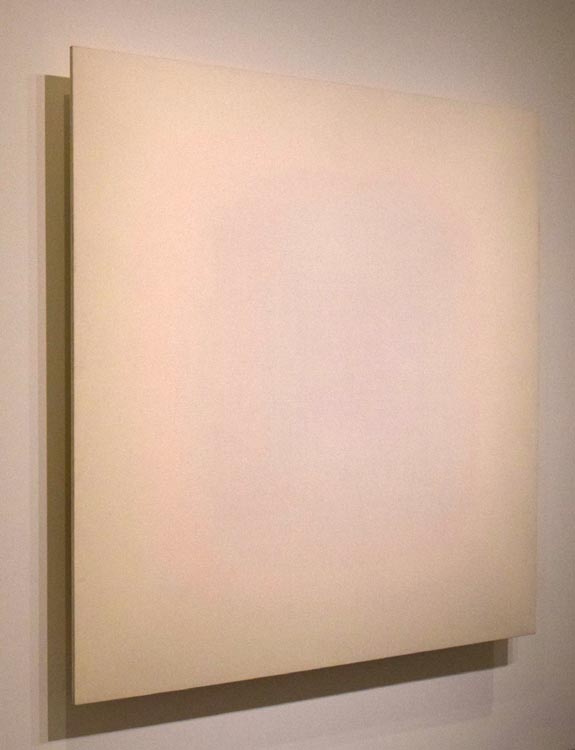
I had my second group of "canoe strip canvas" pieces photographed by RL Photo Studio in Burlington, Vermont a couple of months ago. With this group I experimented with painting the entire surface, taking wood grain out of the work. Because the pictures are, for the most part, taken straight on center, the best indication of the shape is found in the drop shadow. 

This first piece was painted while doing a residency at Vermont Studio Center. The free-form style was a big change and challenge for me, but was completely the result of being in that intensive environment and being pushed to try new things.
Timeless
acrylic, milk paint, and shellac on wood
32" x 41.5" x 7"
2017
I have a small garden plot in front of my house where I grow thing deer won't eat, like kale and mesclun mix. I love grabbing hand fulls of greens whenever I walk by and eating them immediately.
Garden Snack
acrylic, gouache, milk paint, and shellac on wood
32" x 43.5" x 7"
2017
I love my truck, a 2003 Toyota Tacoma with >200,000 miles. If you saw it you would think, "I bet that's Rob's truck."
Truck Love
mixed media on wood
32" x 43.5" x 10"
2017
Twilight
acrylic, milk paint, and shellac on wood
32" x 35.5" x 6.5"
2017
Below are two new pieces in my "ART?" series. I love that it is a completely ambiguous question, allowing many interpretations and many times more answers, so I feel it is a question worth repeating and recreating in different forms. Ideally, the ambiguity spurs discussion and thought, which I believe is more important than any specific interpretations people identify. Personally, though, I'm kind of stuck on the interpretation of what art can do in this increasingly divisive and scary political environment the US is experiencing; as in, "What good is art?" or "How can art be used to bring people together?" However, I love hearing what other people think when they see it.
ART? (4)
acrylic, graphite, milk paint, and shellac on wood
32" x 36" x 5.5"
2017
To construct ART?(5) I used the actual forms from my 16 foot canoe. 
ART? (5)
acrylic, gouache, milk paint, and shellac on wood
32" x 35.5" x 13"
2017
Because the piece is so deep, I thought it was necessary to take images from each side as well.
ART (5) 
second view
ART (5) 
third view
I have a couple of show scheduled for 2018 where I hope to display these and my earlier ones. Stay tuned for more info.

Friday, March 3, 2017

Canoe-Strip Canvas Series

After completing my canoe in 2013 I had quite a few strips left over that I had planned to use for something but I was waiting for inspiration as to how I could best use them. 
Canoe
mixed hardwood
16'
2012-2013
Finally, over the past summer, I realized I could create interesting shaped "canvases." Going Aboard was the first. I was listening to Moby Dick a lot at the time (all the way through twice and then on shuffle with the rest of my music for about a month more) so I think it was fitting, on a couple of levels, to name it after one of the book's chapters. (Photo credit for all the subsequent images are RL Photo Studio, Burlington, VT)

Going Aboard
acrylic, oil pastel, and shellac on basswood and walnut
35" x 27" x 9"
2016
Upon seeing the series, a friend implored me to get a 22 gage pinner to hide the attachment method. The result is definitely cleaner and less distracting. With this one I needed to mill new strips, this time out of curly maple, cherry, and walnut. 
Stage Fright
acrylic and shellac on maple, cherry, and walnut
36.5" x 43" x 6"
2016
The Gam is another Moby Dick inspired title, it refers to the meeting up and exchange of pleasantries of whaling ships on the seas and though I wasn't thinking about the chapter when I made the piece, when I was looking for a title I realized the word expressed what I had in mind in designing it. 
The Gam
acrylic and shellac on maple and cherry
36" x 43" x 5"
2016
I was reading a book by the Dalai Lama over the summer in which he mentions that it is a good idea to have images of the Buddha around one's home. In thinking about it, and why I didn't have any, I realized I didn't like any Buddha images I had ever seen and that if I would have one that I'd like, I'd have to create it myself. With Follow Wisdom I wanted to abstract the image so that the concept of the Buddha would be more important that the specific person that modeled for it. Additionally, I chose to create radiating rainbow colors because Buddhist texts often refer to Buddhas dissolving into rainbow light.
Follow Wisdom
acrylic and shellac on walnut and birch
32" x 35" x 9"
2016
I was in the Washington, DC area the week of the presidential election, going to museums and galleries, and seeing a lot of word art. I generally get annoyed by word art, probably because of my dyslexia, but on my way back to Vermont the two things were on the front of my mind when I was inspired to create a series of pieces that just said "ART?". As a dyslexic, I appreciate its brevity, but what I really love is its ambiguity. What is it asking? How many different ways can it be read? What is/are the answer(s)? I see it as a starting point for open-honest dialog, which is badly needed right now. 
ART?(1)
acrylic, tinted and clear shellac on ash and walnut
32" x 34.5" x 8"
2016
Because it can be read so many different ways, I feel it is a question worth repeating. For my second ART? piece, I rework a canoe-strip canvas that I "finished" over the summer. I like that it isn't immediately obvious what, if anything, it says.
ART(2)
mixed media on basswood and walnut
36.5" x 43" x 6"
2016
I also started reworking some experimental "shellac paintings" I created back in 2010 by painting acrylic designs on top. I think the play between the acrylic foreground and tinted shellac background is interesting.
Occupy
acrylic with tinted and clear shellac on birch plywood
18" x 24"
2010/2017
Open House
acrylic with tinted and clear shellac on birch plywood
26.5" x 22"
2010/2017
And finally, I had rough-cut Obsession back in 2014 but left it lying around the studio for a couple of years. Again, listening to Moby Dick gave me inspiration to finish it. The title refers to both Ahab's quest and to the act of creating this sculpture.  
Obsession
acrylic, oil pastel, oil stick, and shellac on birch
10" x 28" x 2.5"
2014-2016


Tuesday, December 20, 2016

Art Flag Commission

Over the summer I was asked by gbA, a Montpelier architecture firm, to create an object (not necessarily a flag) for the flag pole outside their offices. After some thought, I decided to stick to a "flag" format because I love that with a flag there is an implied meaning but that with a unique abstract design the meaning is completely ambiguous.
gbA Flag
fabric
36" x 70"
2016
I researched whether to have the design printed but I didn't like the materials and I didn't think it would "fly" very well, and when I looked into buying the fabric and having it sewn together I realized it would look much better; thankfully, it was cheaper as well.
gbA Flag (on site)
85 Granite Lane
Montpelier, VT
Given that I lack the both the skills and equipment to construct the piece, this was my first opportunity to pay someone to make my art.
gbA Flag (closeup)
The piece is obviously an outgrowth of my bumper sticker series, hopefully I'll have more opportunities to create a series of flags as well.

Friday, December 16, 2016

Robert Irwin @ Hirshhorn Museum

Here is my belated review of the Robert Irwin exhibit at the Hirshhorn Museum titled All The Rules Will Change (April 7 to September 5, 2016). The show chronicled Irwin's early years and his rapid shift away from abstract expressionist paintings to ground breaking work that is entirely original in its efforts to break down the barriers between art and everything else. With many of his pieces he is so successful it is difficult to distinguish where the art ends, in fact that is the point, there is no boundary.
Title Wall
One of the first series of work in the show are some of Irwin's "Pick Up Stick" paintings. They are designed with the children's game in mind. I believe there were three on view, all with yellow backgrounds and different colored over-lapping lines.
Ocean Park
oil on canvas
1960-61
Between 1961 and 1964, Irwin worked on a series of much more minimal, much cleaner Line Paintings.
Jake Leg
oil on canvas
1962
Jake Leg (closeup)
The late line paintings became even more subtle, with Irwin painting only a couple of horizontal lines in the same hue as the background, making them difficult to distinguish background from foreground, and making it difficult to photograph as well.
Untitled
oil on canvas
1962
Overlapping a bit, chronologically, were Irwin's Dot Paintings. These went even further in obliterating boundaries by creating the sense of light on canvas rather than paintings. They were a major step in his effort to create a painting without painting. Though he used paint on them, they created the sense that he did not.
Untitled 1963-65
oil on canvas
These are, again, very difficult to photograph as the lens doesn't know what to focus on.
 Untitled 1963-65 (closeup)
My favorite work in the show were the two disks, below, that represented work from his disk period, 1966-69. They are very disorienting in a way similar to Anish Kapoor's work. Looking at them from the front left me with complete confusion as to what I was looking at. The intent, and its realization, is to break down the boundary between the artwork and the surrounding environment. By fabricating a mysterious object and lighting it in a precisely designed way, he is able to create a situation in which the object, the lighting, and the wall have equal importance to the work of art.
Untitled
acrylic paint on shaped aluminum
1966-67
Only from the side you can figure out what you are looking at.
 Untitled (second view)
Untitled (1969) is equally mysterious and it is even more successful in blurring the line between where the object ends and the wall begins.
Untitled
acrylic paint on shaped acrylic
1969
Untitled (second view)
 Untitled (third view)
The final piece in the exhibit was a piece made specifically for this exhibit. Conceptually, it gives the impression of being a square that encompasses the inner circle of the museum. There was a warning before entering the section that the work can be disorienting for the viewer which creates an atmosphere of anticipation followed by disappointment or confusion when one enters the section and one is unable to determine what the art is or even where it is. Ultimately, the work isn't just the object but also a dynamic created by the mind of the viewer, the object (or lack thereof), and the intent of the artist.
Square the Circle
fabric on wood
2015-16
I found the video interview of Irwin at the Los Angeles County Museum of Art from 1973 very interesting if only to get a sense of how he thinks and talks. He is very articulate in describing his highly abstract concepts. One thing I remember him saying is that there is no relationship between why he became an artist and what he was doing at the time (and I'm sure even more so now). He started on one path but it ended up leading somewhere he could not possibly have predicted.
Video Interview Still
Los Angeles Country Museum of Art
1973
Before this exhibit, I hadn't been very familiar with Irwin's work. I had seen an installation of his at Dia:Beacon a few months earlier but I don't recall another occasion of seeing his art. 
Excursive: Homage to the Square3
@ Dia-Beacon
2015
Consequently, I found the show to be a great opportunity to learn more about this unique and influential artist. The Hirshhorn did an excellent job in pulling off an exhibit of an exceptionally difficult conceptual artist to display.

Wednesday, October 5, 2016

Sealed-Bid Auction Experiment

As with most artists I know, at times I struggle with too much inventory and finding ways to move older work. In thinking of ways to resolve this problem, I have decided to experiment with conducting a Sealed-Bid Auction. To  start with, I am offering five pieces. Depending on the results, I may offer another five pieces in a few months.

-- If you are interested in a piece, email me the amount you are willing to pay for it by 11:59 pm, October 11, 2016 (I'll reply with a confirmation email); 


-- There is no minimum bid;


-- Highest bid for any piece wins, if there is a tie, the earliest bid wins;

-- Potential bidders are welcome to inquire about additional images, including high resolution versions;

-- Potential bidders are invited to schedule a studio visit to see a piece in person as well as other work I have available;

--Because shipping costs will vary, i have posted the price for the continental US (other locations should inquire for cost);


-- Winning bids are confidential.

What Remains
acrylic and shellac on butternut
33" x 8" x 4"
2014
Shipping Cost: $30
Year of Dreams
acrylic and varnish on maple
21" x 8.5" x 2.25"
2014
Shipping Cost: $12
Brasilai Bound
acrylic, epoxy, graphite, tinted shellac, shellac on mixed hardwoods
24.5" x 32" x 1"
2014
Shipping Cost: $30
Something Moved
gesso, tinted shellac, shellac on board
14.5" x 33"
2010
Shipping Cost: $20
Thrice In A Lifetime
tinted shellac, shellac, varnish on maple and cherry
36" x 36.5" x 1"
2008
Shipping Cost: $40