Monday, July 15, 2013

Furniture With Soul II @ Gallery NAGA

This summer Gallery NAGA has organized a second show of artists featured in David Savage's book, Furniture with Soul: Master Woodworkers and Their Craft. For background, you can see the review I wrote last year here. As an added bonus, the show features even more artists from the other side of the Atlantic whose work is rarely seen in the US.

This year's show is equally great, with plenty of stunning work that truly push the boundaries of what furniture is and how it relates to art. Interestingly, I found my favorite piece to be one that was more conceptual than the others. Yuri Kobayaski's Being is emotionally powerful, conveying a tension between what is public, for everyone to see, and what is private, that perhaps we don't have a right to know about. It can be simply viewed as a chest of draws, however, it is really much more complex. Without any walls to protect the interior, the viewer can look right through it as if it has nothing to hide;
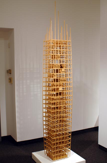
Being
ash
108" x 17" x 11"
2005
Yuri Kobayashi
In contrast, the small draws feel very intimate and private, as if they hold secrets, even though they are totally exposed. I found this contrast scary and uncomfortable, while at the same time, admirable. Additionally, notice how it is difficult to tell where the top ends. It seems to fade to nothingness, as if there is no separation between it and everything else. It is borderless/endless but still, very small and personal.
Being (closeup)
I also love her second piece, Current, and believe it is the equal of anything else in the show in spite of it being the smallest and "simplest" work on display. Though minimalist in design, it is skillfully constructed with a surprisingly technical complexity. She had taken nine strips of ash and bent them so that each piece retains its individuality as it rotates from being glued edge-to-edge on the left side to being glued top-to-bottom on the right.
Current
ash
18" x 45" x 7"
2013
Amazingly, as they shift, each strip has terraced edges rather than being sculpted smooth.
Current (second view)
The edges are most visible in the image below. Notice how the thickness of the strips also decreases as they overlap so she is able to maintain the full length of the strips without an incongruously thick stem.
Current (closeup)
Also notice the elegant finish to the stem.
Current (closeup)
Though Yuri's sculptures are certainly standouts, a number of pieces were exceptional by any standard of design or technical execution. Of particular note is Marc Fish's Mollusque. Unfortunately, the images I thought I took seem to have disappeared so I grabbed them from the gallery's site.
Mollusque
sycamore, glass, copper
32" x 72" x 41"
2012
Marc Fish
It is a phenomenal piece, made with copper and wrapped with sycamore (probably English sycamore, which is linguistically a little confusing because it is actually a maple - Acer pseudoplanunus). Amazingly, the wood is thin enough to fold around the tight curve but thick enough to carve ripples (and for this I wish I had my images) all around the piece, perhaps and 1/8" deep, that create an illusion of a beach-worn shell surface.
Mollusque (second view)
Curiously, in contrast to last year's show that had two equine pieces, this year there are three mollusks. The second one is by Joseph Walsh, also a low table sculpted as a weathered shell, again with a textured surface.
Erosion I - Low Table
rippled ash, olive ash, white oil
21" x 67" x 35"
2009
Joseph Walsh
With the treatment of the surface and the whitening (with oil) he is able to mimic the look of a time-sculpted shell.
Erosion I - Low Table (second view)
The third mollusk inspired piece is Alun Heslop's Razorfish (table). Again with a white ash, the piece resembles a wave sculpted sea floor with the razorfish making up the legs, seemingly poised to pop out of their holes. 
Razorfish III
ash
21" x 73" x 24"
2013
Alun Heslop
From underneath you get a better view of the holes. They remind me of Bart Niswonger's work, and perhaps were carved with the use of an industrial drill press, as Bart does.
Razorfish III (underneath)
Daniel Lacy's Chestless is innovative and interesting in how it is constructed without a chest for the draws to fit into. Instead, the draws slide on a rail system that is invisible from the front.
Chestless
British cherry, ash, Lebonon cedar
58" x 15" x 21"
Daniel Lacey
From the rear you can see how the draws slide. In addition, by creating a decorative crevice along the side that can be used as a handhold, he is able to maintain a sleek, clean line (void of handles) along the front.
Chestless (second view)
Michael Puryear's Asian influenced desk and chair combination, Win Jinan Shifu, is light in color and design. The seat and table top float above their bases as if levitating, creating a magical element to the work. 
Wei Jinan Shifu (chair)
English sycamore, wenge
30" x 29" x 22"
2005
Michael Puryear
Wei Jinan Shifu (second view)
Both pieces are impeccably designed and executed. I particularly like the high contrast lumber selection. Often I find this combination to be too jarring, but here, perhaps because the dark wenge helps to create an additional illusion of floating above the floor, it is particularly appropriate.
Wei Jinan Shifu (desk)
English sycamore, wenge
29" x 60" x 20"
2005
Michael Puryear
With this close up of the desk top, you can see the highly figured boards he used.
Wei Jinan Shifu (desk - closeup)
The last piece that I'd like to highlight is Reveal Chest of Draws by Waywood, a small team of furniture-makers in Chadlington, UK. It has such beautiful, flowing surfaces, again, uninterrupted by handles. It obviously inspired by nature but, at the same time, is elegant and contemporary.
Reveal Chest of Draws
walnut, maple, oak, Lebanon cedar
55" x 28" x 20"
2010
Waywood
From the side you can also see the handholds that allow for easy opening, and the decorative joining technique used in the draw fronts.
Reveal Chest of Draws (closeup)
And finally, I have to congratulate Gallery NAGA for curating such an ambitious, and expensive, show for the second year in a row. The logistics of working with so many artists from so many different places -- including the shipping, handling, and promoting -- is a remarkable feat that matches the accomplishments of the participants. It has been such a treat to be able to see, and touch, work that I would, otherwise, not even know about.

Monday, July 8, 2013

Duncan Johnson @ Marcia Wood Gallery and Hotel Vermont

On a recent trip to Atlanta I stopped in the Marcia Wood Gallery and, although the show had officially ended, I was lucky to find most of Duncan Johnson's latest show still on view. 

The show stopper is certainly Color Code. It is the largest and most dramatic piece in the show. I love how the snippets of color are isolated between large segments of rough sawn lumber. The color sections become miniature minimalist paintings, each as interesting as the next. In part, because Duncan assembles his paintings from scraps of wood he finds at his local Vermont dump, the piece seems to be a perfect balances between the atmosphere of a rural, historic, environment with a cosmopolitan, contemporary art world. The two are often seen as dichotomous but here they exist in harmony.
Color Code
48" x 60"
2013
Notice that Duncan subtly adds nails and graphite lines to the surface, perhaps as part of the construction but also contributing another layer interest. The lines and nails tie the piece together visually and physically.   
Color Code (close up)
Another close up to show the texture of the rough sawn lumber.
Color Code (close up)
With this side view, you can see how thin Duncan mills the wood strips.
Color Code (side view)
Hotel Vermont, a recently opened high end hotel in Burlington, had the wisdom to ask Duncan to enlarge the piece to be used as a focal point for their business. It is interesting how the piece states visually how they want to be viewed by the public, as they say on their website -- Rustic and Modern, Local and Global, Natural and Sophisticated. It is so tied to their marketing that they placed it behind the reception desk, used it as the background for their website home page, and an image of it is on their key cards. 
Color Code (Hotel Vermont)
79" x 128"
2013
Color Code (moderate close up)
Color Code (close up close up)
Hotel Vermont even commissioned a video to be made of Duncan constructing the piece. It shows his process from dump scrounging to hanging.
With all of Duncan's work, there is a interesting contrasting balance between meticulous design and construction verses a casual acceptance, and even appreciation, for things the way they are. There also seems to be an appreciation for history and mystery. The work asks many questions of the viewer and provides few answers.

Other favorite pieces from his Atlanta show include:

Tug Sunday, with its stunning pastel series along the top;
Tug Sunday
40" x 30"
2013
Decoder, with its cryptic partial lettering;
Decoder
36" x 28"
2012
and its time-worn distressed surface;
Decoder (closeup)
Flagman, with its alternately directional patterned stripes,
Flagman
30.25" x 25.75"
2013
and more distressed surfaces;
Flagman (closeup)
And Overhead, with its eye catching pattern of "Xs",
Overhead
18" x 13"
2013
and multi-layered peeling paint colors.
Overhead (closeup)
I find it interesting how Duncan captures the same ideas, techniques, and styles as so many modern painters, but he does it with real life works of art. Many modern painters spend their time building up their surfaces and tearing them down. They rough up their work trying to imitate the effects of time. In contrast, Duncan has found a sophisticated way to use the real thing. 

Wednesday, July 3, 2013

Box of Courage

I have a new piece on display in Stowe, VT through October as part of Helen Day Art Center's Exposed exhibit. There are twenty-four sculptors and four writers participating this year with art displayed through the downtown and along the bike path.

My piece, Box of Courage, is designed to be interactive. I want people to climb in and become part of the art. I feel that the piece isn't complete unless someone is inside. The great thing about a work of art like this is that it is always changing with infinite possibilities/combinations. With every new person, or group of people, and every new position that they take -- and even as time passes with people frozen in place -- the piece changes. In addition, because of the irregular shape and irregular polygon painting on it, the work also changes depending on the position of the viewer.
Box of Courage
plywood, exterior latex paint
84" x 84" x 47"
June 2013
I painted it with primary colors because I want it to look like a playground object but I also added black because I felt it would add a little maturity and take the edge off the pure playfulness.
Box of Courage (second view)
I titled it, Box of Courage, because I feel the piece deals with the emotion of courage on several levels. First, for most adults, it take courage to interact with a box such as this and enter inside; children, of course, don't have this issue, they react fearlessly and know how to play with it. But adults are much more inhibited and will tend to refrain from letting their inner-child out. Second, anytime we face and overcome a fear, we become more courageous so the act entering in the box adds to a participants overall courage. And finally, once inside the box, it provides a protective shell which, in itself, gives someone the freedom to be more courageous.
Box of Courage (as a finished piece)
I look forward to seeing how people react to it throughout the summer. Conveniently, it is situated next to a bench so I can casually over hear their interactions. Helen Day Art Center is also encouraging people to take pictures with the art and posting them on a Flicker account, so hopefully, I can see documentation there as well.