Sunday, January 29, 2012

Clark Derbes' Shapescapes @ Helen Day Art Center

Since seeing Clark Derbes' wood sculptures this summer at the Burlington Art Hop, I've been a big fan. So I was really looking forward to his solo show at the Helen Day Art Center in Stowe, VT and I'm happy to say I haven't been disappointed. Clark calls this new series of wood sculptures "Shapescapes." I asked him why and all he said was that it is the name that stuck. I can see his point, their erratic, warped cuts, and random angles makes me think that the piece is changing form in front of my eyes. It is an uneasy feeling as if I'm looking into a world in which I have know idea what I'll see around the corner. Each movement creates a shift in perception so that you are continually looking at a new sculpture as you move around a piece. It is very different than any other sculpture that I've ever seen. As a result, I've needed to post many more images than I normally would so that readers can get at least a small sense of what the pieces are about. 

I'm particularly captivated by Time Traveler III. Being on a pedestal and being able to walk around it accentuates its dramatically different viewpoints.
Time Traveler III
carved and polychromed poplar
2011
Time Traveler III
carved and polychromed poplar
2011
Time Traveler III
carved and polychromed poplar
2011
Time Traveler III
carved and polychromed poplar
2011
Looking at these five images now, it is hard for me to believe that they are all of only one sculpture. If I hadn't been to the show, and known that there was only one checkered sculpture on a pedestal, I wouldn't believe that it is the same piece.
Time Traveler III
carved and polychromed poplar
2011
Though you can't walk around the wall pieces, they still playfully test the viewers perception of perspective.
Time Traveler IV
carved and polychromed poplar
2011
As you move to the left, the piece seems to warp in front of your eyes, as if light doesn't behave like you expect it to.
Time Traveler IV
carved and polychromed poplar
2011
Time Traveler IV
carved and polychromed poplar
2011
Another thing I like about Clark's work is its approachability and casualness. In addition to the playful approachability of the optical effects, the rough cuts, the wearing down/"antiquing" of the colors, and the natural checking/splitting of the wood result in art that creates a relaxed and fun environment. Though fun art can sometimes be saccharine, the abstract subject of these gives them a more cerebral quality.  
 Time Traveler IX (seated portrait)
carved and polychromed poplar
2011
Time Traveler IX (seated portrait)
carved and polychromed poplar
2011
The black and white pieces as well as the colored triangle ones have a Stella-esque feel in design if not aloofness. The triangles even seem to cause another perspective bending effect as with Time Traveler X, the point of the triangles conflict with the actual angles of the sculpture.
Time Traveler X (seated portrait)
carved and polychromed poplar
2011
 Time Traveler X (seated portrait)
carved and polychromed poplar
2011
Time Traveler VIII (seated portrait)
carved and polychromed poplar
2011
Time Traveler VIII (seated portrait)
carved and polychromed poplar
2011
Clark doesn't go to a lumber yard for his material, he gets it by chance. If he sees someone cutting down a tree, he'll ask for some pieces. He then cuts the green logs with a chainsaw. Because the lumber is still very wet, it splits as it drys. The effect creates and irreverent aspect to the work. It is another way of saying that fine art doesn't have to be precious to be appreciated.
Time Traveler
carved and polychromed poplar
2011
Again, it is hard to believe that these two images are of the same piece. I'm simply making an assumption based on their proximity from my camera download.
Time Traveler
carved and polychromed poplar
2011
I had seen this piece previously at the Art Hop show. Being ash, it is quite dense and heavy. Clark estimated that it weighed about 500 lbs. I think it is the most approachable sculpture in the show, perhaps because its unpainted and scarified surface. It seems to beg to be joined in repose.
Time Traveler XI
carved ash
2011
Time Traveler XI
carved ash
2011
And finally, I normally don't include non-wood art on my blog but I'm making an exception for this encaustic piece because it looks to be a painting of one of Clark's wood sculptures (earlier series). What a great subject -- a figurative painting of an abstractly painted abstract sculpture. Besides, I really love the texture and colors.
 
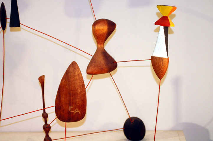
Concentric Hypercube
encaustic

Friday, January 27, 2012

Wonder

I just finished this piece, Wonder. It started as a "doodle" of sorts, with no plans, direction, or preconceived objective. I'd always thought it would be interesting to play with a board of curly ash but had never found any in the lumber yard, but then, I was looking at a scrap board that had been left over from a shelving project and noticed a little curl in the grain so I figured this was my opportunity. The left side is camferred at a real low angle, maybe 20 degrees? The other side is rounded, also gradually. I also left some of the light planning marks on it. Though I normally go back and clean up any marks I find though the shellacking process, I didn't see the point on making the surface of this one perfect, at least not in that way.
 Wonder
shellac on ash
38" x 8" x 1"
©Robert Hitzig
The difficult part about this piece was in dealing with the extremely open grain in ash. Granted, there are ways to fill the grain that aren't so time consuming, but I also wanted to fill the pores with color and if I filled the grain first, I wouldn't be able to, and if I filled the grain after adding the color, I was afraid the color would be obscured. I ended up doing a partial fill and then used shellac to do the rest, which requires a lot of polishing and then waiting a few weeks for the pores to open back up and then repeating the process many times. There may be a better way to do it but this is what I did this time.

Here is an image of it with a white background and shadows.
 Wonder (white background)
And here is a closeup image. You can see at least one of the planing marks on the far left side. It is interesting how tinted shellac will exaggerate even the slightest imperfections. I don't think it would have been noticeable with any other process.
 Wonder (closeup)

Saturday, January 21, 2012

Great Museum Seating

I recently visited the Museum of Fine Arts in Boston to see Ellsworth Kelly's show of wood sculptures, however, in order to avoid getting thrown out of the museum for repeatedly violating their policy of no photography in the special exhibit, I wandered around the rest of the museum hoping that the security guards would rotate out -- which they did about every 45 minutes. In doing so, I saw a lot of great art, but what I was really excited to find were these world class benches and seats that the MFA had strategically placed in unassuming and surprising places.  The first that I stumbled across was this pair of Wendell Castle chairs in the ancient Asian art gallery.
Zephyr Chairs
walnut
1979
Wendell Castle
What an absolute treat! I'd never had the opportunity to sit in a Castle chair and I can now attest that not only are the stunning to look at, they are also quite comfortable.

As I left this spot I made a point of keeping an eye out for more great seating and in a nearby room of Asian horse sculptures (and paintings?) I found this fantastic Judy Kensley McKie bench.

Pegasus Bench
mahagony and leather
1979
Judy Kensley McKie
Though I couldn't find a label identifying the bench I think this is the correct title because it is how Edward Cooke referred to it his 2004 interview with Judy. As with many of her animal sculptures, Judy engages the viewer by designing these horses/pegasi with a little mystery. In looking at them, you can't be quite sure what they are at first, you need to look longer and think about it. It creates an appropriately mythical feel to the piece. Unfortunately, the bench engaged at least one visitor a bit too much given that one of the ears had to be reattached.

Then, not to far away, I think in a gallery of Greek sculpture, I came across this impeccably designed bench by Hank Gilpin.

Bench
curly maple and walnut
1999
Hank Gilpin
The top is a very wild piece of curly maple with the cracks and splits left naturally unfilled or repaired.
Gilpin Bench (top view)
But from the bottom side you can see the remarkable quality of the design and execution. For example, note the gentle curve in the stretchers, the through tenons that are left slightly proud, the pins in the leg securing the tenon are also slightly proud, and, most interesting, look at how he helped to make the bench top look lighter, as if it is floating above the base, by creating a half-inch(?) gap above the legs and by also camferring the edge of the bench. In doing it, he has given a very light feel to a piece that is very solid in its construction. 
Gilpin Bench (underneath view)
Though I continued to look for more great seating during the rest of my visit, I didn't find any more. However, in checking the museums inventory, it looks like there is also a Maloof in another of their less visited galleries (although the MFA has graciously decided to invite the general public to use these great works of art from their permanent collection, I don't think they want them to be subject to the kind of abuse they would experience in their more popular galleries). I'll definitely keep an eye out next time I'm there and will update this list as I locate them.

Wednesday, January 11, 2012

Sushi At Three

Here is my first piece of 2012:
 Sushi At Three
shellac on curly maple
24" x 33" x 1.5"
January 2012
©Robert Hitzig
It really needs to be looked at from the side in order to get the effect I was experimenting with. I consider it a progression from my wedge series but in this case I'm cutting the wedge as a resaw rather than a ripsaw. 
Sushi At Three (side view)
Since this was the first piece using this style of wedge, I was a little nervous about how it would turn out, however, in the end, I was pleased with the effect. I'd like to see a large piece in this style, with many more sections, but I'll wait to get some reactions before committing to another. I especially like the overall outline it creates with the wall. It reminds me of Frank Stella's irregular polygon series, but I find this work much more interesting.


Update January 14, 2011: Based on a comment, I thought it would be useful to include images of this piece with a white background. Let me know what you think and if I should continue this style or the ones above. I know my photography still isn't the best. I think I need to get more lights to improve the accuracy.
 Sushi At Three (white background - front view)
Sushi At Three (white background - side view)

Thursday, January 5, 2012

Another Side of Calder

On a recent trip to DC, I stopped in the National Gallery and found the Alexander Calder room. On seeing the exhibit there were two things that struck me; first, many of the pieces were made with wood; and, second, I didn't think the work was great!?! I found these points shocking because I had never previously considered Calder a wood artist and, second, I don't remember ever seeing any of his work that I didn't consider brilliant.

For example, there was this piece, Untitled (the wood mobile) that he made in 1943. Interestingly, though he is still playing with themes of balance that he often uses in his metal work, this piece combines 
odd juxtapositions in a clunky and inelegant form. The title is a bit confusing because it doesn't look like the piece moves, so maybe it is a joke, but even if it does move it can't have nearly the movement or elegance of his true mobiles. 
Untitled (the wood mobile)
1943

Then there is this piece, Untitled (Constellation Mobile), which reminds me more of Calder imitators than the master himself. In addition to clunky, I would describe it as chaotic and incoherent. It doesn't seem to have any of the elegance or refined craftsmanship his work typically displays. 
Untitled (Constellation Mobile)
1941
Untitled (Constellation Mobile) (closeup)
And here is his Vertical Constellation With Bomb, similar to Untitled (above) in its chaotic nature and irregular, seemingly unrelated but artificially attached, forms.
Vertical Constellation With Bomb
1943
Vertical Constellation With Bomb (closeup)
In comparison, here is a non-wood piece, Little Spider, in the same exhibit and constructed during the same period (I took the image off the Smithsonian website because I mistakenly didn't photograph thinking that I should only capture the wood pieces). I feel that it is unarguably a great piece -- elegant, light, well balanced, a fine combination of both complexity and economical design, gracefulness, while being completely original. Even in a still photograph it has movement. It is the kind of work that has made Calder Calder. 

Little Spider
1940
Alexander Calder

His Wikipedia page and the Calder Foundation Biography both say that he made these wood pieces during the war because metal was hard to come by. Maybe, though this Spider piece uses barely more metal than Untitled above and it is hard to believe that he didn't have a few more scraps laying around. In addition, he made pieces with wood from the beginning of his career to at least 1951. Perhaps it would have just been too embarrassing to be ostentatiously making all metal pieces at the height of the war.


I think that if he really intended his wood pieces to be a substitute for his metal work, they would have been more graceful and less quirky. Instead, it looks to me like he was just using the time and the medium to explore a different side of his artistic self. It reminds me of Matthias Pliessnig's quirky ad lib series that I mentioned in a post a couple of years ago. Matthias is famous for his gracefully swooping, wave-like benches, but he also makes odd little sculptures with found objects that don't seem to have any relationship to his benches. I think in both cases, and in my own experience, the mental intensity and physical demands of making something beautiful and elegant creates the need for a mental counter-weight, something that can let one part of your mind rest and while you do something different. 

Work like this can be rejuvenating. On their own, this counter-weight art could easily be dismissed -- if this is all Calder made he likely would have long since been forgotten -- but in the context of his other work it is great, even if at first it is confusing, because of what it allowed him to make when he was ready to. I have no evidence, but I believe he made this work because he needed to and when some one asked him "why" he used the war as an excuse. I'd bet he also had a secret stash of odd pieces that he made in private much later that he just never wanted to show but which gave him the ability to concentrate on his monumental work. No evidence, but I'm just saying, I think this work is a glimpse into the another side of Calder he didn't show often.